 fushimi
画像なしで表現するリストマークのサンプルいろいろ

行頭記号やリストマークなどの装飾を、画像なしで実現する方法で普段よく使うものをリストアップしてみました。
今回は、
- 先頭に何かしら装飾をつける
- 2行目以降の先頭を1行目と揃える
以上の2点をリストアップの条件にしました。
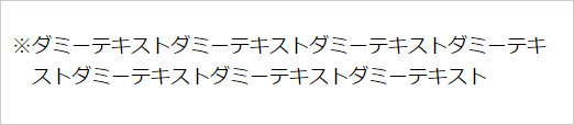
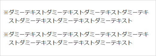
sample1 装飾文字を直接記述(全角のみ対応)
まずはシンプルに、直接HTML上で行頭に「※」を挿入する方法。
2行目以降の先頭が1行目と揃うように、text-indentで「※」の1字分下げてやります。
そのままだと行の先頭が1字分左に寄ってしまうので、その分左マージンを取って調整します。
p {
    text-indent: -1em;
    margin-left: 1em;
}
※ダミーテキストダミーテキストダミーテキストダミーテキストダミーテキストダミーテキストダミーテキスト
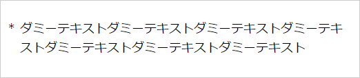
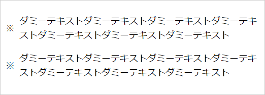
sample2 装飾文字を直接記述(全角・半角どちらも対応)
装飾に使用した記号の幅が1em以下の場合(半角記号など)、2行目以降の先頭が1行目の先頭とずれてしまいます。
それを解消するため、装飾記号をspanで囲みます。
p {
    text-indent: -1em;
    margin-left: 1em;
}
p span {
    display: inline-block;
    width: 1em;
    text-indent: 0;
}
<span>※</span>ダミーテキストダミーテキストダミーテキストダミーテキストダミーテキストダミーテキストダミーテキスト
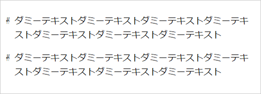
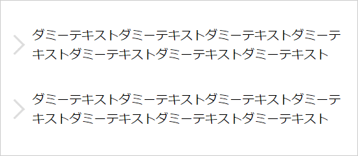
sample3 装飾文字をCSSに記述(HTMLに記述しない)(全角のみ対応)
数が多い場合など、いちいちspanで囲むのは面倒なので、CSSのみで表現したのがこちら。

p {
    text-indent: -1em;
    margin-left: 1em;
}
p:before {
    content: '※';
}
sample4 装飾文字をCSSに記述(HTMLに記述しない)(全角・半角どちらも対応)
sample2と同様、半角記号を使う場合などは装飾記号部分の幅を指定してやれば、2行目以降の先頭もずれません。

p {
    text-indent: -1em;
    margin-left: 1em;
}
p:before {
    content: '*';
    display: inline-block;
    width: 1em;
    text-indent: 0;
}
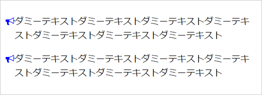
sample5 装飾文字を文字参照で記述
文字参照を使うと、いわゆる文字以外のいろいろな記号を表現することもできます。
p {
    text-indent: -1em;
    margin-left: 1em;
}
p:before {
    content: '\00270c';
    display: inline-block;
    width: 1em;
    text-indent: 0;
}
■ 参考
contentプロパティで挿入できるコンテンツ
contentプロパティに日本語を使うと文字化けすることがあるので、文字参照を使ったほうがいいかもしれません。
sample6 装飾文字にウェブフォントを使用
文字参照にweb-fontを組み合わせるとさらに表現の幅が広がりますね。もちろん色だって変えられます。
p {
    text-indent: -1em;
    margin-left: 1em;
}
p:before {
    content: '\0f0a1';
    display: inline-block;
    width: 1em;
    color: #00f;
    font-family: 'FontAwesome';
    text-indent: 0;
}
ここではFont Awesomeというウェブフォントを使用しています。
sample7 文字ではなくCSSプロパティを使用した装飾(1)
ここまでは文字を使った装飾表現を見てきました。
もちろん装飾記号を使わない表現もいろいろあります。
borderプロパティを使った三角矢印はいろいろなバリエーションができますね。
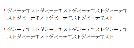
p {
    text-indent: -1em;
    margin-left: 1em;
}
p:before {
    content: '';
    display: inline-block;
    width: 0;
    height: 0;
    margin-right: 4px;
    margin-left: 4px;
    border: transparent solid 5px;
    border-left-color: #f00;
    vertical-align: 4px;
}
sample8 文字ではなくCSSプロパティを使用した装飾(2)
ダイヤ(ひし形)も文字参照でも表現できますが、使わずにも表現できます。
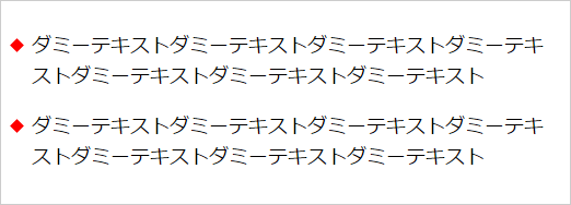
p {
    text-indent: -1em;
    margin-left: 1em;
}
p:before {
    content: '';
    display: inline-block;
    width: .5em;
    height: .5em;
    margin-right: .5em;
    background: #f00;
    transform: rotate(45deg);
    vertical-align: 2px;
}
sample9 CSSのみで記号+連番
注釈番号などを入れたい時に便利なcounter-incrementプロパティ。
※(こめじるし)などを一緒に使いたい時など、順序付きリストよりも表現の幅が広がります。
ちなみに※(こめじるし)は日本語特有の文字で、英語圏では*(アスタリスク)などを使うようです。
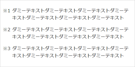
p {
    text-indent: -2em;
    margin-left: 2em;
    counter-increment: calc-ex9;
}
p:before {
    content: '\203B'counter(calc-ex9);
    display: inline-block;
    width: 2em;
    text-indent: 0;
}
sample10 CSSのみで記号+連番(アルファベット)
counter-incrementは数字だけでなくアルファベットも使えるのが便利。
カッコつき数字の表現などもカンタンにできますね。
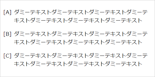
p {
    text-indent: -2em;
    margin-left: 2em;
    counter-increment: calc-ex10;
}
p:before {
    content: '['counter(calc-ex10, upper-latin)']';
    display: inline-block;
    width: 2em;
    text-indent: 0;
}
sample11 text-indentではなく、positionを使用
sample11はsample3と見た目は同じですが、cssの書き方を少し変えています。
p {
    position: relative;
    margin-left: 1em;
}
p:before {
    content: '※';
    display: block;
    position: absolute;
    top: 0;
    left: -1em;
    width: 1em;
}
sample12 複数行の縦中央位置に文字を配置
sample11までは、1行目の高さに合わせて記号を表示させていますが、デザインによっては複数行にわたる領域の中央に表示させたいこともありますね。
p {
    position: relative;
    margin-left: 1.5em;
}
p:before {
    content: '※';
    display: block;
    position: absolute;
    top: 50%;
    left: -1.5em;
    width: 1em;
    margin-top: -.8em;
}
sample13 複数行の縦中央位置に文字以外を配置
リンクなどにありそうな矢印のデザインもcssで表現できます。
p {
    position: relative;
    padding: 10px 10px 10px 2em;
}
p:after {
    content: '';
    display: block;
    position: absolute;
    top: 50%;
    margin-top: -0.7em;
    left: 0;
    width: 1em;
    height: 1em;
    border-top: #ddd 3px solid;
    border-right: #ddd 3px solid;
    transform: rotate(45deg);
}
sample13は、親要素のフォントサイズを基準にしたスタイルなので、親要素のフォントサイズを変更するだけで装飾部分のサイズも追随させることができます。
今回はpタグにスタイルを指定しましたが、もちろんulやolなどのリストタグやその他のタグでも使えます。
画像を使わない方法は、色やサイズなどのバリエーションを作りやすいので色々な方法をストックしておくと便利です!